FIRST THINGS FIRST your logo is not your brand, it’s simply an identifier a visual symbol of your brand. The story you tell and the experience you give your clients over time while showing your identifier are what help people associate your brand with your logo. Your logo, with time, becomes how people remember your brand.
The recent Gap logo disaster has been decoded by NeuroFocus in such a pretentious way that I had to laugh. Saying things like “Sharp edges unsettle the subconscious” and “the subconscious prefers fonts that are a little unusual” and how about “In the new logo, the ‘p’ superimposed over the blue square is essentially bypassed by the brain”. What a bunch of…I won’t say it but it rhymes with gap.
![]()
When creating your small business logo don’t think of any of those things. It’s like I tell my kids when I buy them a shirt that doesn’t quite fit right, “you’ll grow into it”. Over time your logo will become the identifier that you dream of it becoming. That said here are some quick things to consider when designing your logo.
1. Don’t copy somebody else’s logo – if you like something about another logo make a note of it and try to incorporate it into your design.
2. Choose the right colour – the dominant colour of your logo will tell something about your product or service. For example: white is the colour of purity, black is the colour of luxury, blue is the colour of leadership, purple is the colour of royalty, green is the colour of environment and health. And whatever you do, DON’T use the same colour logo as a competitor, choose something completely different.
3. Keep it horizontal – your logo should be designed to fit both eyes and unless you have eyes one top of each other, keep it horizontal. A horizontal logo is especially important when you have a retail location with a sign over the front window.
4. Pick a readable font – most people don’t care what font you use, ‘legibility’ is the most important thing especially as you are trying to establish a new business. The power of a logo is in the name and not the typeface.
5. Work your core marketing statement into the design – especially when you’re trying to establish a new business you need to tell them what you do, either in words or visually or both.
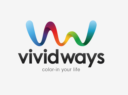
Here are a few of my favourite logos from around the internet:
![]()
![]()
As you can see I like simplicity.
TIP: Have your graphic artist create 3 versions of your logo: the full colour version (of course), a black & white version and a white & black version, one goes on a white background, the other on a black background. Also, what some graphic artists forget is to give you an .eps or a ‘vector’ image of your logo. Essentially, you can make it as big or as small as you like without compromising print quality.
B!Gshots Bottomline: Create a logo that’s meaningful to you and your business and then start building your brand experience around it.
 I will never share or sell your information with anyone. Ever.